If you find yourself having strong opinions about the suitability (or otherwise) of various fonts for the purposes for which they are used, you may like to visit http://www.comicsanscriminal.com/.

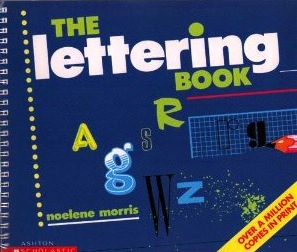
Having grown up in the era when computers went from being the domain of the nerdiest boy (why always boy‽) in the class; to being a sign of affluence and/or sophistication (hey, I’m an Apple girl, what can I say?); to now, when a computer is a ubiquitous household appliance … where was I? Oh yes. Having grown up as all these changes were unfolding, I can remember my joy at discovering all the beautiful alternatives to Courier that there were out there. Having the artistic abilities of a clipped toenail, I spent way too many hours at primary and then high school patiently (alright, impatiently) copying letters for school assignments from that great institution of student typography, The Lettering Book. Even this low res image of the cover brings me out in a slight sweat. So being able to tart up titles by pointing and clicking was an absolute dream come true. And although the fonts when I was at high school were pretty ugly, by the time I got my own computer there were dozens of fonts, and some that even looked like handwriting! Woohoo! (I’m a doctor’s daughter, so my appalling handwriting is not my fault.) (Hi mum!) I’m only mildly embarrassed to confess that most of the essays I submitted at uni were set in Palatino.
I still quite enjoy a visit to the Ragnarok Scriptorium (now under a different – and far less interesting – name), although I can’t really justify doing anything more than browsing. My inner Goth enjoys it slightly too much. But I have gradually come to understand the importance of restraint in matters of typography, even though, deep inside, some part of me still yearns to throw good taste away and break out in Curlz MT … just don’t get me started on how weird it is to discover that there’s a font called Joanna. (But apparently “quiet elegance distinguish this design from most other serif typeface designs.” So now you know. And can decide for yourself.)
For those of us who are interested in learning more about fonts and font selection, Fonts.com has an unbelievable amount of information and opinion.
I won’t tell if you don’t.


Oh my gosh, I’ve come over all funny now. What a great post Joanna.
That cover is mightily familiar to me too and stirs up all sorts of feelings.
I am a bit of a typo/fontophile too, and got a book called Just my type out of the library
Loved it so much I had to buy my own copy. It features ‘Fontbreaks’ with cool little articles about famous fonts. The one on Gill Sans has led me into reading more about Eric Gill.
And I’ve fallen in love with Zuzana Licko’s Mr and Mrs Eaves fonts .
Joy.
I shall have to go looking for that book! And thanks too for the Mrs Eaves link – I can see the chances of getting any work done today are slim and getting slimmer …